Hooper wasn't weaned by the classical stylists of the modernizing cinema. The modern narrative-visual medium was increasingly becoming something more and more tied to either heavily psychologized dramatic screenwriting (think Playhouse television or Elia Kazan's slathered visual and verbal hysteria) or to spectacle, and Spielberg managed to master both personalities and even meld them to a commercial, visual zenith. Hooper, on the other hand, his succor was the modernist, the avant-garde, the documantarist (with a different, less saturated or affected sort of imagistic code from the narrativists), or the tableaux artists of melodrama (narrative artists, yes, but also of a different code, also less saturated by the affective possibilities of the dramatic-visual "center," only then to radiate out their attentions to the peripheries of the focal subject; instead, the old-fashioned melodramatists were more interested in the simultaneous depth and width of the inanimate frame). Where Spielberg taught himself to honor the dramatic happening, Hooper learned to view beyond it, to postulate the existence of an objective camera that took the world in as is, as aerated emotion and mood, before succumbing to overweening fidelity to what is exactly coming out of a person's mouth, or to the direction they gaze. In Poltergeist, indeed the gaze is made integral to the way the characters perceive the world, as related to the cinema as one of spectacle, but Hooper is not merely interested in being attendant to their gaze, but weaving a landscape - necessitating an individualized eye - around the focal point of their gaze. The "dramatic stylists," the "psychological realists," etc. of Spielberg's visual upbringing, were attentive. The involvement of style in the drama characterized the evolving "sophistication" of mainstream entertainment, eventually bleeding over into the evolving televisual medium where Spielberg got his start. Hooper was adrift in the plenitude of an overwhelmingly visual medium - separate from the sophisticated filmmaking of mainstream trajectory. Sophistication, in his realm, rested only in the techniques of the camera, without scripts or psychological performances to arrest these errant "art filmmakers" from the excesses of an entire world of visual references as resources - "excesses" that would often manifest as the opposite of excess. That is, an excess in ungrounded image-making (the "images" I attributed to Spielberg in the previous paragraph are the grounded kind, the kind conceived of in writing or in storyboards, but not allowed to breathe in the excesses of the world), but in the deprivation, or restraint, of psychological impetuses. In other words, seeing human drama as part of a world or a landscape became, in the trajectory of the mainstream, just seeing drama - unless one was deprived of such a thing and thus must look at the world or landscape first. Even the classical melodramatists or modernist filmmakers, working with fully-involved, sometimes self-penned dramas, were able to make their drama less focal and more abstract, more fantastical, by paying attention to the uncanny areas of the living environment and lived-in landscape that surrounded the "center" (the center events and characters).
The Heisters is odd, in that it offered Hooper a short, naive opportunity to resemble conventional dramatic conveyance and some psychological awareness, in its dealing with three characters caught in an ostensible action and event-oriented fiction, involving constant physical interaction, inter-character conflict, and comedy-based event driving it forward (not the vague, mood-based storytelling that would inform the narratively spare Eggshells and Texas Chain Saw Massacre). Yet the modernist absurdism of The Heisters, not to mention its silent nature, make it less a dramatic piece to visually organize, but something much more aesthetically independent still. Eggshells and Texas Chain Saw consist of brazen experimenting; Eaten Alive inches closer to allowing Hooper to yield a true "dramatic realist" style, but such a language, while surely within his toolkit, was not yet called to the fore, the haphazard nature of the project and perfunctory production making him suspend further attempts at the old forms of classicism and instead expanding on his previous films' boot-string aestheticism. Not that Hooper, if given the proper budget right away, would have been exhibiting the spectacle-driven Hollywood precision and dramatic sleekness of Poltergeist without the prospect of Steven Spielberg being his producer, mentor, and usher into the world of popular filmmaking. After all, The Funhouse and its script barely pushed him to adopt such kineticism of Dream Factory tentpole filmmaking, though he could have, I suppose, insisted that there's no reason a slasher film could not have the cartoonish spectacle of true popular filmmaking of the time; instead, Hooper decided to make something subdued, critical, and adult, awash in moralistic fantasy and deconstruction. But Eaten Alive is not bereft of mainstream flourishes, despite the daft and utter allegory of its conceit. If it would take Spielberg to make Hooper work with the sleek placement of bodies in array, their attentions devoted to a spectacle before them, Hooper still shows, in Eaten Alive, a desire to block and place actors in a way that is decidedly contrived, in a decorative Hollywood fashion, such as Robert Englund (as Buck) atop a vehicle, Neville Brand farther off in alignment, engaging with him, and Marilyn Burns a foreshortened figure in the distance.
It is no doubt fact that Eaten Alive's producer and cinematographer were in an agreement to push for quickness in a way of doing things that Hooper wouldn't have thought ideal, but he and Robert Caramico, who has shepherded at least one other work of true artful motions before (Lemora: A Child's Tale of the Supernatural), attempt what can be said to be a nascent form of the Spielbergian tropes that would finally be realized, by Hooper, in Poltergeist. There is no such image of figures of regimented authority in alignment, a staple in Spielberg, in any film of Hooper's before Poltergeist, though he manages to carry it over into Lifeforce and Invaders from Mars. True. But one can say, when he filmed Eaten Alive, he had yet to see Close Encounters of the Third Kind, the pinnacle of Spielberg's Men-of-Authority, Ducks-in-a-Row aesthetic hang-up, released the same year, and so he would not have learned this aesthetic penchant of his future producer. I will say this penchant never so much occurs in Poltergeist except in brief, inconsequential morsels, while everything left of Spielberg's mannered blocking is thoroughly "ghosted," made immaterial, when buried neck-deep in Hooper's baroque impulses, his thoroughly Hooperian ideas of a fresh and expressive cinema.
Salem's Lot and The Funhouse let him follow his natural instincts, closer and closer to a "commercial style," but, admittedly, not yet were the keys to the kingdom of a thoroughly prepped, thoroughly vetted previsualization and detailed, luxuriant production schedule handed to him yet. Neither is the visual impetuses of spectacle and theatrical-style blocking that Spielberg had perfected, and that Hooper would make even more perfect.
We can look at Salem's Lot, The Funhouse, and Eaten Alive as gestures to populist cinema, but they instead looked inward, into themselves, to be something as serious as they warranted. Hooper would not be able to have complete fun until Poltergeist. Let's talk about Spielberg's storyboards, then. Frank Marshall said he did them all, Hooper defended himself once by saying he himself did half of them. This was years later, in which Hooper may not have meant literal storyboards at all, instead using it as a mere shorthand to say he feels responsible for a majority of the film's visual design and visual flourishes. Let's also try to define the word "all" in regards to storyboards. Is the entirety of a film usually drawn up in storyboards, or just certain scenes? How many storyboards are we talking about, exactly? These are all niggling facts. How important of a role, in the end, do storyboards usually serve during shooting, outside of the most broadly planned scenes involving major action and special effects? This is rather niggling, too. How common is the scenario where a director decides to utilize a storyboard only to act as springboard for their truer inspirations? Niggling. This is just Part I of this walk-through entry, we will get to the important points, the actual images and the film itself, in Part II.
It is not until Poltergeist that the inspiration and means to adopt a style of full mainstream visual excess (the fact that Lifeforce followed and exhibited the same excess without Poltergeist's mainstream smoothness is hardly the marker of proof that Hooper did not drive the visual style of Poltergeist, as a project as often directs the director as much as their stylistic traits carry over between them, and Lifeforce, subversive sci-fi ad absurdum, dictated that Hooper was not about to make another Poltergeist) would allow him to meld the modernist with the mainstream, the avant-garde with the accessible, the documentarian-tableaux-artist melodramatist with the Spielbergian template.
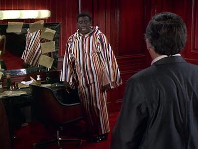
This defines Hooper. On the opposite end, Spielberg was directing classically dramatic Actor's Showcases from Day 1, his debut being, of course, directing Joan Crawford herself, as if Spielberg was already convinced he was meant to be king of cinema and he'd have no less an adversary than Baby Jane's sparring partner herself. His second Night Gallery segment was Make Me Laugh, about a talentless comedian who makes a fool's bet on the value of constant admiration, and Godfrey Cambridge is already made to soliloquize as if it were Chayefsky he was reciting, Spielberg naturally his appointed Lumet. The talent is there, the vision was there. Executives seemed to see it, and Spielberg's ascent to commercial powers was set into motion. From the very beginning, you see, he was given the tools to cultivate his commercial style, in a studio setting. So when we see things he was capable of pop up in Poltergeist, which he wrote, which he partly, then, saw in his brain, it is the result of someone who knows what is expected from a piece of dramatic film. But what is neglected is Hooper's own capability, shown in inklings but deprived in his rough-hewn, homegrown sensibility and previous output. But the inklings may be all it takes for the fact they exist in a sensibility that was raised on the complete opposite end of the industry and filmmaking idiom from Spielberg. To realize he can apply the stylistic markers he had shown thus far and refine them for something vaguely in the ballpark of Spielberg's commercial art is the credit we should be showing Hooper, for, in Poltergeist, he is able to adopt the commercial, dramatically potent style of full-blown studio filmmaking and then pull it back, modify it greatly, bring the world, the landscape, the math, and the rhythm to it all so that the film as it is feels like his more than it does Spielberg's, despite all that Spielberg himself put into it.
Here is an example of Spielberg's "dramatically potent" style, a kinetic classicism that can only mean a modern classicism, one that may be detected in the embryonic phases (the scripting, the storyboarding) of Poltergeist. We have characters in a frame interacting in a network of interactive lines of engagement, the camera sliding forward and backwards and allowing certain characters to engage, then allowing a third to slide in and intercede, replacing the partner in the previous dance of engagement.
A slide forward in engagement.
A slide back...
... and the rushing in of a new partner along the dramatized dolly track of fervent engagement.

The elided partner speaks and the directional camera allows the present two's off-screen glance to signify the appeal of this remembered third partner.
And a sliding fro.
... the drama potent for its being along the allegorical designation line of passionate engagement.
Another directional coup, similar to the expert way in Poltergeist that a depth-field of characters can interact, with the directionality of their glances carrying the potency of the emotion.
Spielberg's foreground-background use is another trait of creating dramatic gravity, the foreground player allowed to express the depth of his feelings, aided by the vivid visual cue of his proximity, while the background player is graphically made small.
The soliloquy as dramatic tool, an arresting, pop-flavored tic to ingratiate us to a main character, while allowing background figures to act as contrast to our act of extreme audience identification.
Spielberg's blocking that is a constant switching between high affect (the moment of soliloquy, of audience address) and a reversion to a plainer diegesis, when the characters are in motion or directly addressing one another, is what makes his drama, as a pop gesture, so engaging. The constant movement is a stylistic wager, a marker of traditional dramatic blocking, blocking and mise-en-scene becoming one.
The characters join together in a moment of particular dramatic import, camera pulling out to join them in portrait.
Soliloquy, again.
And camera movement to poeticize one man's fantasy. The background figure is elided, in more precise choreography.
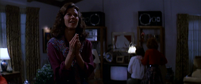
Now let's look at a moment from the living room scene from Poltergeist.
What you can see is something of a revival of the "line of dramatic engagement" that Spielberg created in the scene from "Make Me Laugh." It is vividly directional, visually attentive to the relationship of each character to the other and how they interact. Camera movement is used in both sequences to isolate a character. What can be said is that there is a more careful eye in this modified sequence from Poltergeist, which, as I previously studied in a post, diverges largely from the existing storyboards, seemingly expands spontaneously on any form of pre-visualization, in the favor of a more rigidly formalist sense of the widescreen space and the emotional solidity of the characters and their predicament. This attention to aesthetic is one that highly disregards the literalness of the drama. Even the dolly-in to JoBeth Williams is more interested in truncating a smooth narrative or emotional throughline for something alarmingly exclusionary toward forward narrative movement. The camera movement, then, cannot be called a "dramatic" tool, a pop tic, but something that stops narrative and drama, eliding all sense of the exposition surrounding it, even the exposition of emotion, for Diane Freeling's emotion is almost obstructionist in how pure it is and how long we spend with it. In a temporal sense, yes, but mostly in a truly arresting dilation effect from how precisely located that emotion is within an off-center dolly shot, and one that geometrizes her emotion at the expense of all other visual information, outside of the rafters of the ceiling (all without her moving an inch or forwarding anything but one simple emotion that is already in play before the movement began). The aestheticism of the frames, and the lack of motivation, that is, dramatic motivation, is something that makes Poltergeist different from all the tentpole summer filmmaking before it.
Now let's take a look at a scene from Eaten Alive:
The rafters again make an appearance, directionalizing Neville Brand's dismay, using the materials of his domain but emanating towards a world outside of his domain.
The drama of interaction begins with the imposing of emerging beings into his world, his place of comfort, symbolized by the fog-shrouded canopy.
Eaten Alive is very much a stagebound film, evinced by characters constricted to a minimal setting, entering and exiting each others' spaces.
The inside versus...
... the outside. Spaces are liminal, boundary-defined, separated states of existence. Judd's engagement with Lynette is as tied to a space - the threshold of Judd's hotel, a place of his vulnerability to visitors from the outside - as Buck's (Robert Englund) transgression of it, practically stealing (a key) from his vulnerable client's business (Buck sells Judd drugs).
The transgression continues when Buck and Lynette enter into the hotel and Judd is left, impotent, outside.
Now Hooper has never been one to use Spielberg's trope of foreground soliloquy and background uniforms - even Lifeforce fails to fetishize the image of the Men of Authority standing at attention in mannered figuration behind a foreground figure, as metonymy for power (Hooper is very rarely interested in the bulk strength and intelligence of professional institutions, he is only interested in individuals) - but with Judd, he comes close, without the ability to dress the background with faceless Cecil B. DeMille extras (a symptom also known, by me, as quantity-fixation). Judd is his clearest precursor to Diane Freeling, their emotions placed at the foreground, other characters only existing beyond their emotional line of sight.
Here, another off-center dolly motion places a character at a fraction of the frame.
The camera move in this shot, though, does have a motivation (but is it dramatic motivation?), beginning its descent and curve as Judd appears in the doorway behind Buck.
So the motion does propel narrative - a narrative of suspense - but can we say its particular geometry has anything to do with narrative, with the direction of movement, but instead more to do with the uncanny ability of persons to appear out of nowhere? The camera does not move with any correlation to Judd's movement, outside of instance in time; it instead revolves around him, pushing him back rather than urging him forward. We feel for Buck, who is completely ignorant to anything around him, including Judd's entrance.
What we see is Eaten Alive's similarly vivid, theatrical mise en scene, sans Spielberg's own classicalist tropes. I choose to see the more complex, knotty aesthetician Hooper in Poltergeist's simulation of high-end Hollywood style. Whatever style Spielberg would endow to a piece of big-budget Hollywood resources, it is picked apart by his stoppages, the disconnect between his beauty and his shortages in coherence, chipped away by crassness. Whatever style Hooper endows to a pinched-budget, tight scheduled and resource-starved production, he elevates it to a Hollywood standard - that is, as shown in his works pre-The Funhouse. It is a bit ironic that, when finally ushered into true studio filmmaking, he would make a film as reserved as The Funhouse, which is stylistically bereft in a way Salem's Lot, Eaten Alive, and The Texas Chain Saw Massacre are not (a fact which also makes it a masterpiece of subtle designs).
Let's take a look at a scene from Salem's Lot.
L
A roaming camera, a curving, circuitous dolly shot, a patience and painterliness unseen in the works of others.
Now you can choose to see the "Make Me Laugh" scene as precedent for Poltergeist, or you can choose to see precedents in the sublimated theatricalism of Eaten Alive, Salem's Lot, and The Funhouse. With Spielberg, there is style, but there is not idea. There is not cohering movement. Spielberg's
camera movements stop short at the one concept, the one image. Hooper pushes
through to the image having a meaning, a particular purpose within
a visual syntax. Spielberg does not create musical lines, he creates bars that he unites into a single piece. There is never the musicality, there is only the fits and starts.
I had drafted a majority of this post, as well as the below tables, before the sad news of Hooper's passing this week. Below, indeed, are convenient tables I made to preface a section that would comprise as "EVIDENCE." Below that are revealing excerpts from a Q&A Master Class at London's FrightFest.
It all seems to boil down to the idea of "creative force" versus how much weight Hooper was able to exert on set, even with Spielberg assisting and perhaps coming in with ideas of his own. It may be in the details that we must find Hooper, for he asserts overall ownership of the film's visual approach, while concedes Spielberg did "write the screenplay."
He cites collaboration (referred to as "discussions") but makes the unequivocal statement that Spielberg was simply watching him put the film together, piece it together through his work and, of course, Spielberg's input.
And this is perhaps my favorite quote suggesting Spielberg's overweening hand and Hooper's instinct to mold the raw materials to his own vision. I can only imagine the film Spielberg would have created, filled with leavening gestures that would have severely denuded the film's almost ethnographic eye over the rituals of suburban America. I can just imagine him - Hooper - working out with Beatrice Straight the vicissitudes of Dr. Lesh, the idea of her character as the academic bohemian polar opposite to Steven and Diane's complacent atomic-unit responsibilities, her harsh taskmaster emerging whenever Steven and Diane are pushed to the brink of weepy passion. Dr. Lesh is a true character, capable of moods and alterations, and I could only imagine Hooper playing with that fact, the way he molded a similar Rorschach performance out of Neville Brand, out of many of the characters in Eaten Alive and Texas Chain Saw Massacre, films driven by the inchoateness of the world and thus the malleable, amorphous actions and moods of its characters. This harshness, or "edginess," is reintroduced in the interstices of Poltergeist.


No comments:
Post a Comment